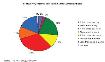
First of all, this isn't very good data to use pie charts for. There are too many categories for people to visually compare them quickly. The orange 11% looks more or less the same size as the yellow 12%, same with the blue 17% and green 20%. Secondly, the labels on the right side is faulty. You spend too much time looking back and fourth on the figure to match the color with the category.
In this case, a simple table with the data would have been much easier.
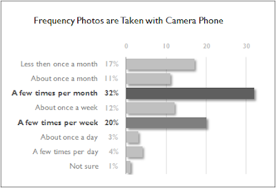
The only categories discussed in the article, are the two largest ones,"A few times a week" and "A few times a month". If those are the only two important categories, and you wanted to make a chart of it, something like this would be better:
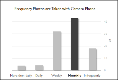
But the main point was that people didn't use the camera function very often. Most used it only a few times per month. To state that more clearly, I would at least combine some of the categories. Maybe something like this:
Of course, the main conclusion in the article was that people used their cell phone cameras the same way they used digital cameras. Wouldn't that be infinitly better explained if they actually included data from used of regular digital cameras?
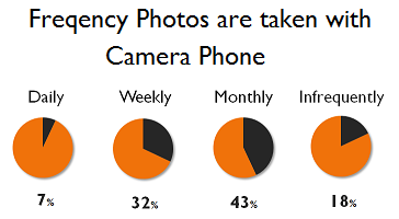
Part 2: Now with pie charts
Edit: Torbjørn said in the comments section that he didn't like pie chart. So I decided to try to present the data above with pie charts. Here is as good as it gets from me:


14 comments:
Very nice figure improvement transition - good job, Boss. One would almost think you worked with presentation of trends from data sets for a living ;-)
Doesn't this "study" fall squarely within the gigantic "Epic misrepresentation of statistical data by soft-science schnucks" category?
It sure does. This study is wrong in so many ways.
One would almost think you worked with presentation of trends from data sets for a living ;-)
Actually, my side-gig really made me appreciate good data presentation. So many horrible examples out there...
Some people might say that I'm stereotyping soft scientists in their treatment of quantitative data. I prefer to call it pattern recognition within a population.
LOL
And you have the statistics to back up your claim?
;-)
Why; certainly. :-)
First of all, this isn't very good data to use pie charts for.
Personally, I have never found use of a pie chart.
I've actually used it once in a presentation, but I'll be damned if I can remember what for
Doesn't this "study" fall squarely within the gigantic "Epic misrepresentation of statistical data by soft-science schnucks" category?
Did you know that 57% of all statistics are made up on the spot_
And that, statistical speaking, there are two popes per square kilometer in the Vatican state (it's true)?
T-bombz, I tend to agree. In most cases, there are graphs that better represent the data then pie charts. Though I've seen some very goods. The worst ones are the 3D ones...
Did you know that 57% of all statistics are made up on the spot_
Curses - I was gonna use that one, but I figured I'd maxed out on my one-liners for the day
Oi! Some bastard set theclock backwards in the last frame >:-(
LOL
Yeah, pie charts have a tendency to either look like watches or pacman.
Pie charts get way more interesting when they look like Pacman! I have never thought of that before!
Post a Comment