Friday, October 30, 2009

A lesson in sucktitude

Two days ago, we got an email from the Department Head strongly encouraging us to register for a two-lecture deal on ergonomics and stress management. The first lecture - ergonomics at computer workstations, took place yesterday, scheduled for 90 minutes.

Two minutes after I entered the lecture hall is when I started sensing that something was wrong. First of all, I was the only academic staff member from the department present. The Department Head, although present in the very same building, was nowhere to be seen. When the lecture started, I really sensed some serious suctual overtones happening. The physiotherapist in charge started by stating that she was very happy to have the opportunity to give this lecture in English, seeing as how she really needed the practice.

No freakin' kiddin'

She then went on to say that this course was really supposed to have happened earlier, but she was on sick leave due to - you guessed it - back problems and repetitive stress injuries to her shoulders and wrist. Despite her claim of having 20 years of experience as a physiotherapist, she also needed a cheat sheet to give the definition of physiotherapy. So right off the bat this was like taking "how to win friends and influence people" lessons from the two douchebags currently incarcerated in Kongo. Or taking ethics lessons from Sudbø.

In what appeared to be four months but which turned out to be only 95 minutes we then were equipped with shocking new revelations such as "Adjust your chair to a position that's right for you", "take frequent breaks to avoid repetitive strain", "don't have reflections from lighting coming off of your computer screen" and so on.

The maximum sucktitude was saved for last, however, when the physiotherapist had all the participants partake in an impromptu (for us at least) aerobic exercise session to the elevator and supermarket classic "Vem Vet" by the introspective Swedish diary-reciter Lisa Ekdahl. Following this, the instructor even had the nerve to plug her upcoming set of recommended exercises accompanied by a CD comprised of her own selection of what she referred to as "modern music".

That's a cool 95 minutes of my life I'll never get back.

Blues tune of the week

Ending this segment of weekly blues tunes with an all time favorite band of mine, none other then the little old band from Texas: ZZ Top. I could have picked a lot of tunes from this band, but I settle for a cover of Stop Breaking Down Blues (no bonus point for guessing the original artist). The reason I went for this tune, is that it featured together a live version of Nasty Dogs and Funky Kings on a CD single in the 90's, and it really restore my faith that ZZ Top still have some more great tunes in them.

Douse that light, enjoy and have a nice weekend!


(Sorry, Wilhelm, I was planing on Just Got Back From Baby's, but couldn't find any clips of it.)

I'm in the top 10 in buisness!

Juhu!
It's only in the tenth position, but I'm still at number 10:

So this is a list over the most frequent used names of daily managers in companies that has gone bankrupt. It has to be at least 1000 companies registered with that name of the daily manager to be considered for the list.

I'm deeply honoured, and will do my best to climb further up on the list!

Sources: e24.no and forvalt.no

Wednesday, October 28, 2009

Epic Arnold ownage of political opponent


The above is a letter from Governor Schwarzenegger to a local Democrat explaining why he refuses to sign a bill into law.

Hint: Read the first letter of every line in the two major paragraphs. You'll find that two words are spelled out.

I have no idea what the bill was all about and thus whether the Governator made a prudent decision, but damn was that ever funny.

Some more graphical design

So, I came by yet another bad chart here. Check out the graph below, which was used in a presentation:


First of all, it suffers from of number of graphical flaws of more or less importance:
  • Vertically aligned text (the years)
  • The use of color (too much)
  • The grey back ground and the ultrabold lines around the legende.
  • The wrong chart type used.
But above all, there is one really major flaw which is unforgiving: It misrepresent the data.
I didn't relised this before I started plotting my own version of this chart. But the stacked bar chart is to represent part to whole ratio. The way it's supposed to be used in this case, is that the whole bar shows the total number of days. The strong color is emergency(ØH) and the lighter color is the planned days (Elektive). I thought it was strange that the emergency days were so much more then the planned days, and when I check the numbers, I found out it wasn't so. The planned days is actually the whole bar, i.e. the sum of the dark and light colored areas. Totally wrong representation of the data.

Also, I do believe that the point of the chart is to show trends over time. That is something a line chart does much better then a bar chart. My version represented the data truely in a line plot, and I also adjusted the colors to look more professional:

I chose to start the y-axis at 2500 rather then 0 (which you can do in a line chart, but not in a bar chart) to expand the data as much as possible in the y-direction to show the variation as clearly as possible. Didn't gain much, so it's better to start at 0 if the relationship between planned and emergency days are important. I also added light grey lines to show the quarters, as these kind of data usually is collected every third month.

If the total numbers of days are important, I would represent this in a three panel chart. Every chart has the same range on the y-axis, but different starting point:

Of course, if the relationship between emergency and planned days is important, a fourth panel of the ration could be added. Or replace the total panel.

(PS: I just noticed I forgot to add the correct weight to the line on the x-axis, but I'm too lazy to correct it)

Edit: I did notice that my source for the numbers was wrong. So the actual numbers may be wrong, but the design of my charts are still valid.

For Torbjørn - Sonata Arctica

Two songs off of "Silence" - San Sebastian:


Weballergy


Update: Until The Last Drop Falls:

Tuesday, October 27, 2009

Disappointing releases from bands you like

I noticed a thread with a similar title over at the Scream magazine board, and thought it was kewl enough to totally jack and revive over here. The point isn't to diss bands you didn't like to begin with, but rather to list releases you found to be not what you expected from bands or artists you actually enjoy.


  • Megadeth - Risk. Big fan of Dave, but he totally rolled the dice and lost on this one. He even admits as much himself, in that he uncharacteristically caved in to pressure from record label and band members to change the musical direction to something that would move more product in the brief period of time when "alternative" music was hot.
  • Iron Maiden - Virtual XI. Just...NO. Good job that Bruce Dickinson returned.
  • Poison - Native Tongue. On paper, replacing C.C. DeVille with a technically superior guitar player - Richie Kotzen - looked like it could work. Upon closer inspection, DeVille wrote most of the music and Kotzen didn't want to play anything but inferior, white boi blues. Thus, the album sucked and still sucks, with the possible exception of "Until You Suffer Some More".
  • Running Wild - Rogues En Vogue. OK, this was the final Running Wild album before Kasparek decided to call it a day, but this release is still very much disappointing.
  • W.A.S.P. - Still Not Black Enough. One would have thought that Blackie Lawless got all of the introspective rebel in search of acceptance, identity and love out on the spectacular "Crimson Idol" concept album. If so, one would be very much mistaken. Not the same quality in songs as on "Idol" either.
  • Joe Satriani - Crystal Planet. Guitar deity Joe Satriani on a synthesizer and techno trip. Ugly. Very ugly. Two thumbs way down.
  • Yngwie Malmsteen - Unleash The Fury. By normal standards, this album reeks of awesomeness. Compared to Yngwie's usual gold standard, it just reeks.
  • Rhapsody - Symphony Of Enchanted Lands II: The Dark Secret. Following up the wonderful "Power Of The Dragonflame" with a name change (Rhapsody Of Fire,due to some copyright issues) and recycled, lameness is just that - lame. Coincidentally, right before this release, the band solicited the management services of one Joey DeMaio from Manowar - the Overlords of All Things Bad about Metal. Subsequent albums have sucked hard. Quite the coincidence...thanks a lot Joey, ya greasy guido POS.
  • Luca Turilli - The Infinite Wonders Of Creation. The guitarist from Rhapsody also hosted a successful side project with similar but more hard-core guitar-oriented music. His first two solo albums, featuring the vocal stylings of Olaf Hayer, totally rule. His third album, with the dubious title featured in bold type, features Nightwish-like vocals, tons of synth and an overall goth vibe. From king of the world to chumpstain in three albums or less, by Luca Turilli.
  • Last Tribe - The Uncrowned. Strong contender for the title of my absolute favorite band not featuring Yngwie Malmsteen. Their debut album "The Ritual" is in my opinion one of the best albums EVER, and the follow-up is also kick-ass. Their third and final album thus suffers from not being able to live up to the phenomenal standard set by Magnus Karlsson and his former bandmates.
  • Eminem - Encore. The low point in Eminem's solo career, as he even admits to himself. Just not his usual standard. Very few strong tracks....
  • Sonata Arctica - Reckoning Night. "Silence" was a phenomenal power metal album by any standard. "Reckoning Night" is a weak attempt at moving away from power metal and into harder material. Fail.
  • Helloween - Pink Bubbles Go Ape. Right off the bat it's a major downer with a title like that. Coming off of two fantastic albums like "Keeper ..." I and II it's pretty hard to keep the trend going, but that's not really an excuse for this reekazoid product.
  • Gary Moore - Blues For Greeny. I much prefer the hard rock version of Gary Moore to the blues version, but all things considered, I really like "Still Got The Blues" and "After Hours". With "Blues For Greeny", however, the Moore-train really goes off the tracks as far as my musical preferences are concerned.
  • Extreme - Waiting For The Punchline. Still waiting...
  • ...many more I'm sure...

Sic transit gloria mundi

Like 'Cube says, it was a good day. Got a good nights sleep, got to work early, got started on preparing new course in applied nanotech. A paper is gonna get submitted to a very good journal today.

Then some kind of clusterf*ck happened.

We're probably not gonna get a new kitchen installed until over New Year's. I was supposed to have a phoner with a prospective grad student, but I never got anything but his voice mail. And the crowning achievement of the day - the Department Head sent me an email informing me that he'd volunteered me as the department's ombud for equal status/equal rights representative at the faculty.

I am now the Crown Prince of Political Correctness and Grand Wizard of Soul-Draining Meetings.

I sense some serious sucktual overtones happening here.

To quote Linda Eide in the last episode of Norske Attraksjoner - "Negative tankar"

If this sucks even half as much as I think it does, I'm going to seriously contemplate my chosen profession.

Sunday, October 25, 2009

Blues tune of the week

This week, Ry Cooder - Down In Mississippi. Some deep delta blues and soul in there. And check out the mean vocal there, courtesy of Bobby King, Terry Evans,  Arnold McCuller and Willie Green Jr. Mr. Cooder sure knows how to pick his musical collaborators.

Enjoy!

Friday, October 23, 2009

Kamelot - Love You To Death


Downer video,but great song...and I'd kill to be able to write such a fantastic chorus.

Bow to the Master

...of music videos, that is. I present to you:

Eminem - We Made You

Just AWESOME...Mr. Mathers proves once and again that he's not your formulaic rapper with videos consisting of Big-screen TVs, rims, hos, jacuzzis and a black leather couch, topped off with Cristal and a bunch of mean-mugging homies pointing at the camera from low angles.

Thursday, October 22, 2009

Chickity check yo'self before you wreck yo'self

...'cause being a smoker is bad fo' yo' health. Courtesy of Professor J to da G - much appreciated, brotha'


Mozart on acoustic guitar

Some pretty schweet playing going on up in heah'

Wednesday, October 21, 2009

New deadline, new possibilities

In November, I'm going to give a talk at a conference, and since I had to submit an abstract in June/July, I thought I was walled in by the, albeit vague, set of perimeters I coughed up to meet the deadline.

However, it turns out that I was in the minority among the invited speakers in that I actually submitted an abstract within the deadline, and so I recently got an email stating that the new, absolutely final deadline for submission of an abstract for my talk would be October 25th.

This leaves me with two options. I can either roll with my previously submitted story, or I can use this opportunity to perhaps craft a completely new story partially based on experimental findings obtained since the previous deadline.

Decisions, decisions...

Tuesday, October 20, 2009

Flickr update plug 102009


Totally awesome skyline. Can't make up my mind as to whether it's got an "apocalyptic/ominous" or "ray of light" look to it

Monday, October 19, 2009

Post-game analysis - addendum

Just some other things that ran through my mind as I watched the other presentations and presenters, all of whom are excellent scientists in their respective fields. In random order, even.

Being able to speak English really well and without a strong accent is pretty much like having a superpower. English is the predominant language in conferences, seminars and workshops, and if your English is burdened with a very strong national accent, you've got to have spectacular charisma and some groundbreaking science to gain back what you lost during the first impression. You've only got one shot at giving a good first impression, and if you sound like the Swedish Chef from Muppet Show, that's the first and probably lasting impression of you, way before you've got a chance to show off your science. Is it fair? Probably not, but if you think said Swedish Cook or someone sounding like the bad Soviet guy from an 80's action flick isn't gonna come off as weak following up someone with a neutral North American accent, all else being equal, then I've got some swamp land in the Everglades that I'll sell to you for a song.

Don't ever, ever, ever, ever, EVER have a lot of slides in the middle of your presentation that you simply skip ("Oh, let's skip this one....and that one..."). You're really sending out the signal that you've either a) simply frankenstein'd together the talk at the last minute without any specific tailoring to the audience, b) don't know what's on your slides, or c) think what's on the skipped slides is too advanced for the audience. Either way, you're SO not looking good doing it.

Don't put up detailed figures and whatnot on the slide unless you actually plan to talk about them. The extra time required by the audience to sweep across and absorb the new material on the slide is time they won't be paying attention to you. When you introduce a new slide, the movement on the screen is going to attract the eyes of the audience. The more stuff is there to sweep across, the more time before the audience is ready to focus on you again.

Presentation Zen testballoon - post-game analysis

After reading Presentation Zen by Garr Reynolds I was quite intrigued by the concept, and decided to battle-test the approach for an invited talk I gave this last Friday. I spent quite a lot more time preparing the slides in order to have them as clean and uncluttered as possible, trying to make sure that I avoided the data dump syndrome. The lab template also took a hike, save for the first and last slides, in order to allow for more empty space. My "Dakara Nani" or "so what" was highlighted very early in the presentation. Moreover, I was definitely the only one at this symposium using the Presentation Zen approach.

So how'd it go?

One thing's for sure - the Presentation Zen approach requires total control over the slide content and sequence, as there are hardly any visual clues beyond what's absolutely necessary to provide a backdrop for your narrative. All meta-content must be thought through well before your name is announced. There is still opportunity to tune the detail bandwidth for each slide or section, but unless you're absolutely familiar with every slide you're screwed. This actually suits me well, because the slides kind of help me stand out, rather than there being any conflict whatsoever with regard to the focus of attention. MUCH more work, though. Next time I'll see if I can get away with even less detail on my slides.

As for my actual presentation skills, I feel I was at about 85%, as I had a few things working against me:
  • I had a cold, and my voice kept coming and going during the morning, so I was somewhat unsure as to how that was gonna pan out. Luckily it held up during my talk and subsequent Q&A.
  • My freakin' remote control/laser pointer totally went south the day before, and I was not familiar enough with the new one. Different positioning of functions and altered response time pretty much meant that I needed to look at the remote almost every time I introduced some animation.
  • Not enough space between the front rows and the lectern/screen meant I had less room to move around than what's my preference.
  • I was last in a sequence of speakers and the guy before me ran more than 10 minutes over. Rather than extend the session too much, I shortened my talk by ~5 minutes. In retrospect, I could've done a better job selecting which ornamental details to skip, although I hardly think the audience noticed.
  • As I was introduced and the chair mentioned the lab I work at, some guy in the audience snickered and shook his head. As he apparently scanned the full author list on the intro slide, he repeated this behavior. I have to admit that this puzzled me greatly - I'm not used to being heckled within the realms of academia - not like this anyways. Having been in a cover band there was always some drunk dude who wanted us to play something different, but this was a strange experience. The same guy also tried to "get" me during the Q&A session, but failed both at provoking me and at asking "difficult" questions. I'm pretty well prepared when I present my work, and I'm actually quite good at what I do, so the combination of heckling and failed attempts at asking "hard" questions only made him look bad. For sure I'd have looked like a loser if I lost my cool, which is apparently all the rage among the more chardonnay- and Absinthe-inclined part of the population.

I later found out who the guy was, and everything became clear to me. Although I've never met the guy in my life, he has strong heat not only with the head of the division where I work, but also with one of my co-authors.

Outside of this, things went very well, and I got plenty positive, unsolicited feedback. I'm going to continue using the Presentation Zen approach, but get better at it.

Sunday, October 18, 2009

Flickr update plug 101809


I've been too busy to find suitable photos for Flickr, but here's the first of a couple' updates. This one's from Malvikmarka, shot by my wife. Awesome colors in this one.

And I used to like the Varg Veum movies...

I've always said that the Varg Veum movies in general is a pretty decent watch, even after pumping out six of them. Ok, I might be a little biased due to the Bergen aspect of it, but still. Even Pia Tjelta's appearance in one of the movies didn't manage to ruin it (basically because I only have to suffer through 10-15 minutes of Ms. Tjelta befor her exit). But know, for some unknown reason, they casted Lene Nystrøm as Varg's girlfriend for the next six, count'em six, Veum movies. WTF?! Barbie girl in a Veum movie? And not only one, but six? And not a minor role either, but Varg's girlfriend? I can't believe. What is the world coming to?

Fairtrade for whom, exactly?

In principle, I'm completely sold on the concept of fairtrade, of paying a little bit more to give farmers a bigger piece of the pie, which puts me smack dab in the middle of the market segment undoubtedly labeled "Gullible - will buy any damn thing".

Case in point, we bought some "Farmer's Fairtrade Orange Juice" recently. The Fairtrade" label was prominently featured on the carton, together with the slogan "The Fairtrade logo - your best guarantee for a good deal".

Now I grant you - getting good orange juice isn't that easy in Norway. Save for fresh squeezed or the Tropicana label, it's mostly bitter, watered-down concentrates. However, I've never tasted an orange juice nearly as vile as the crap which supposedly offers me the best possible deal, both with respect to me as a customer and the percentage given to the farmers.

Orange juice is just that, so how is it possible to make such a crap product? There are basically three possibilities: 1) The farmers associated with Fairtrade absolutely suck at their profession and as such don't deserve a larger piece of the pie than given by major labels. 2) Knowing that some people are gullible enough to purchase a product on the premise of a better deal for farmers in some third-world country, some very cynical distributors take second- or third-rate raw material - in this case oranges - and makes a clearly inferior product. 3) The production plants asociated with Fairtrade are staffed with bottom-of-the-barrel staff that couldn't get a job elsewhere, likely for lower wages.

Either way, there's absolutely no excuse for peddling inferior products under the Fairtrade label. Don't even get me started on the battery acid and antifreeze mixture sold under the label "Ubuntu Cola".

Blues tune of the week

A modern classic, expanding the blues genre in I way that I love, one of my all time favorite artists and guitarists: Rainer Ptacek - Don't Know Why. A rare, previously unreleased music video (I've never seen an official music videos of Rainer, so I guess any video is previously unreleased), but I sure feel that they've manage do make a decent video on a very low budget. And this is a great version of the tune, which I don't think have been released on audio.

Enjoy, mi amigos!

Wednesday, October 14, 2009

That was fast

In the new proposed national budget, the gov't wants to introduce a value-added tax to biodiesel and LPG, i.e., gaseous fuel for motor vehicles. The reason is apparently that the majority of costs associated with personal motor vehicles are associated with accidents, heavy traffic/gridlocks and noise, none of which vary significantly with the fuel source. Thus there is no reason for tax rebates for certain types of fuel.

Brilliant, says I. There is only one singular explanation for this proposal that doesn't bring into play a linear combination of zero eco-cred among the government parties, epic broken promises during the election campaign and several people in key positions not taking their medication. Namely that the pesky problem with CO2 emissions and that whole man-made climate changes-dealie has been called off.

Otherwise, how in the blue hell do they plan to motivate people to purchase more eco-friendly cars when they refuse to lower the taxes for hybrid cars significantly and the fuel for the more expensive cars they're supposed to buy is at least as expensive?

So; now that the red-green coalition has eliminated climate changes, what's on the agenda for next week? End world hunger? Rename Mondays?

Saturday, October 10, 2009

Blues tune of the week

Opening track from the Hendrix "Blues" collection CD: Hear My Train A'Comin'. Sure, Hendrix was known as a rock icon, but he could play some mean blues as well. And I could have picked some more famous blues tunes by Hendrix (Red House anyone?), but the acoustic take of Hear My Train A'Comin' is one of my alltime favorite Hendrix tunes.

Enjoy, and have a nice weekend!

New trend for Nobel Prizes

Some have argued that it's OK to dole out Nobel Peace Prizes based on potential and expressed good intentions. As long as the nominee has promised to get something done, there is all reason to believe that this will in fact happen. Is this trend going to continue into other branches - say into physics and chemistry? Will the prizes be awarded to some grad student based on spectacular performance during doctorate studies as well as the student's promise of more and better results once he or she gets a faculty position?

If potential and media hype was all that was required, how do you explain Marit Bjørgen?

If it is reasonable to assume that what a politician promises during the election campaign will come true once he or she is elected, how do you think SV voters are feeling about Soria Moria II?

Then again, at least they didn't award the Nobel Peace Prize to someone for cutting down on their genocide agenda.

Friday, October 9, 2009

The Nobel Peace Prize 2009... Obama??

Two years ago, there was a bit of a fuzz on m-factor regarding the peace prize being awarded to Al Gore. Well, this year it was awarded to Barack Obama. Now, disregarding the fact that I'm once again ignored by the Nobel Committee: Isn't this a bit too early in his career? The deadline for nomination this year was just a couple of weeks after he was elected president. And, wouldn't it be wise the give it some time, to see whether he actually can but some action behind his plans and promises or if it's just a load of hot air?

I'm amazed by the Committee; are they influenced by all the Obama fan-bois out there and the positive media coverage? If they wanted to use the price in an active way to promote peace work, there are some many other candidates they could have choosen.

So, what do the rest of the poeple here at the A-factor blog thinks?

Thursday, October 8, 2009

More power ballads

As requested and promised, here are a few more power ballads. These are not necessarily the best power ballads of the 80's, but the ones that I have been listened to more than what's considered to be healthy.
This means that some of the songs on this list is also present at Wilhelm's September list.

30)
Scorpions; Holiday


29)
Poison; Every rose has it's thorn (also on Wilhelm's list)


28)
Damn Yankees; High enough (also on Wilhelm's list)

27)
Nazareth: Love hurts


26)
Ozzy Osbourne: Killer of giants


25)
Whitesnake; Is this love


24)
Tigertailz;Living without you
(warning: Absolutely worst of glam!)


23)
Europe: Carrie


22)
TNT: Kings of seven seas


21)
Manowar; Defender


20)
Metallica; Nothing else matters


19)
Frehley's comet: Into the night


18)
Skid Row; 18 and life


17)
Kiss; I still love you


16)
Stage Dolls; Ammunition


15)
Gorky Park; Fortress


14)
Dio; All the fools sailed away


13)
Queen; The show must go on


12)
MSG; But I want more


11)
Yngwie; Hold on


10)
Extreme; song for love (also on Wilhelm's list)

9)
Helloween; A tale that wasn't right
(also on Wilhelm's list)

8)
Alice Cooper; Hell is living without you


7)
Twisted Sister; The price


6)
Guns n' Roses; Sweet child o' mine
(Also on Wilhelm's list)

5)
Cinderella; Nobody's fool


4)
White Lion; 'Till death do us part


3)
Def Leppard; Love bites
(also on Wilhelm's list)

2)
Bon Jovi; Santa Fe


1) Stryper; First love


Overkill??

How charming...

I just saw this article in BA, where a young, pregnant mother out walking was attacked by a
cyclist, because "she didn't get out of the way quick enough". The dude even hit the side of the baby stroller.

There are so many things wrong with this, here are some of the thoughts that I reacted on:
  • You never hit a stroller with a baby in.
  • You never attack a pregnant lady. No matter what's done.
  • On the photo, you can clearly see that this was on the sidewalk. According to Norwegian traffic regulations, cyclist have a duty to give way to pedestrian on sidewalk.
But most of all: You gotta be a real a**hole to do something like that. I can't help being really annoyed when I read something like this.

Tuesday, October 6, 2009

Movie Review - The Battle of the Red Cliff (or Chi bi, as it's called)

So I checked out the John Woo film Red Cliff. As I've understood it, this movie is based (and I use that term lightly) on some actual events in China's history. The basic plot is a classic one: The warlord Cao Cao invates two southern regions of China, which joins forces against Cao Cao's waste army of 800 000 men. Wastly out-numbered, they make their final stand at the Red Cliff, hoping that brilliant war strategist Zhou Yu and the fact that Cao Cao isn't used to naval warfare.

What can I say. The plot is so classic it's almost a cliché. But I'm a sucker for those epic acient battles, and add mr. Woo's signature slow motion splatting, and you got yourself some good entertainment for the evening. Thumbs up!

Friday, October 2, 2009

TGI funny stuff


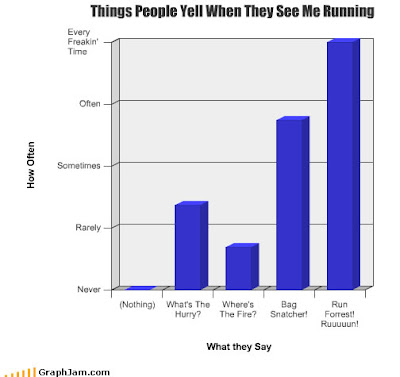
All graphs stolen from GraphJam.com. Have a nice weekend, y'all!

Blues tune of the week

A true classic, from the one and only Boogie-boy himself: John Lee Hooker. Boom-Boom from 1964. ZZ Top got nuthin' on this boy!

Enjoy and have a nice weekend!
PS: Check out the chef at 1:53. :)

Some data...

...to quote Demetri Martin. I've just come across a bad graphs at FINN.no. First off, is a pie chart of the different browseres used on FINN.no:

So what's wrong with this? First off all, pie charts are depending on us camparing areas to each other, and we can't do that very well when there are some many. So this is the wrong type of chart. To make it even worse, the gradient, shading and 3D-effect makes it even harder to compare the ares. The alignment of the numbers can also have an effect to make the perceived area larger or smaller (though there aren't any really good examples on this chart). They should at least have ordered the slices in decreasing or increasing size. Also, the legend on the right makes your eye go back and fourth to match the browser with the corresponding slice of the pie.

A simple table would have made these data much more available and faster to explore for the reader.

But since I'm in a mood for exploring the possibilities and limitations of Excel and improve my presentation/ charting skills, I've suggested a better graph:
I made this just with Excel, no editing. The numbers next to the where made using a "fake" second series with value 0% and named after the value of each browser share, and I use series name as data label, aglined to the left. I would have loved if Excel could do that automatically, and to be able to formate each of the labels individually. For example, I would prefer to have the "%"-sign a couple of points smaller then the number. Also, I think the point of the author was that IE6 is now used of less then 10% of the users. To emphasise that, I could have given the IE6 bar a red color. But, when it comes to colors, I prefer the following rule:

So, I made a version in black and white. Slightly less fancy, but it does get the point across:
Yes, I could have worked a bit more with selecting the greys, but this is the default grey's in Excel 2003.
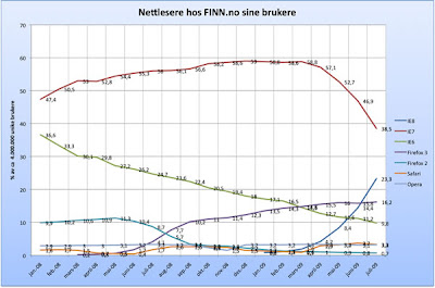
Next up was a line plot showing the trends over time:


Line plots greatest strength is to show trends over time, so in that case, they've choosen the correct type of chart. But there are some bad graphing here as well: The background gradient takes too much attention, the alignment of the titles of the axis are wrong (they should be horisontal), your eyes again has to go back and fourth between the legende and the plot, etc. But my main concern is the numbers on the lines. First of all, they don't add up to 100% (just sum the numbers on the right end) and especially from sept. '08 march '09 it's really hard to read the values on the smallest browseres. I even had to "guesstimate" the values there when I made my own version. Line plots does not do a good job of presenting individual values, bar charts are much better at that. Or a table. So my suggestion for improving this graph, is a combination of a line plot and a table, to get the best of two worlds:
Again I could have spent more time on the colors, but I used the standard palette in Excel 2003. What I really would want to be able to do here, is to formate the table better, so make the legende and headers stand out from the data. But here I'm falling short, I don't even know how to "cheat" in Excel to make that happen. Any suggestions? Still, I do feel my suggestion is clearer and better then the default ones from FINN.no.

The new signature Jimi Hendrix Electric Guitar Package

...from the Gibson Guitar Company. WTF??? Yes, you read correctly, from the one and only Gibson Guitar Company. Yeah, Jimi might have played a few different guitars, but the iconic image of the legend is with a "Fender Stratocaster, maple neck, strung upside down for a left-handed motherf**king genius" to quote Ford Fairlaine. And what to Gibson do? Release an SG or Flying V, which are legendary Gibson models that there at least are some photos of mr. Hendrix playing? No, they copy a Strat and slap on some kind of Firebird neck:
I can't believe the nerve. And this is in collaboration with the Hendrix estate? I've should have filed this under "nonsense"... No es bueno.

Since it apparently is Vader time...

...here's a touching father and son moment. It's funny with these classics, when I see them again, sometimes they are not quite as I rememebered them...