 So what's wrong with this? First off all, pie charts are depending on us camparing areas to each other, and we can't do that very well when there are some many. So this is the wrong type of chart. To make it even worse, the gradient, shading and 3D-effect makes it even harder to compare the ares. The alignment of the numbers can also have an effect to make the perceived area larger or smaller (though there aren't any really good examples on this chart). They should at least have ordered the slices in decreasing or increasing size. Also, the legend on the right makes your eye go back and fourth to match the browser with the corresponding slice of the pie.
A simple table would have made these data much more available and faster to explore for the reader.
But since I'm in a mood for exploring the possibilities and limitations of Excel and improve my presentation/ charting skills, I've suggested a better graph:
 So, I made a version in black and white. Slightly less fancy, but it does get the point across:
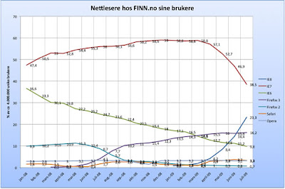
Next up was a line plot showing the trends over time:

Line plots greatest strength is to show trends over time, so in that case, they've choosen the correct type of chart. But there are some bad graphing here as well: The background gradient takes too much attention, the alignment of the titles of the axis are wrong (they should be horisontal), your eyes again has to go back and fourth between the legende and the plot, etc. But my main concern is the numbers on the lines. First of all, they don't add up to 100% (just sum the numbers on the right end) and especially from sept. '08 march '09 it's really hard to read the values on the smallest browseres. I even had to "guesstimate" the values there when I made my own version. Line plots does not do a good job of presenting individual values, bar charts are much better at that. Or a table. So my suggestion for improving this graph, is a combination of a line plot and a table, to get the best of two worlds:


7 comments:
...exactly what do you want to have done with the headers and labels? Bigger font? Bold font?
Nice job.
Hi Jon,
I'm really surprised and excited by seeing your comment here. I love your site and I've learned a lot from it. MS Excel should come with a print-out of your tips and tricks.
Wilhelm: I would love to be able to have full control over the layout. Using bold or grey color to separate the legend and categories from the data. Adding background color to each individual line in the table to guide the eye. Etc, etc.
Hi Anders.
Thanks for using our graphs and showing what is wrong with them. We must obviously do a better job next month when publishing new statistics and graphs.
Hi Eivind.
Thank you for your comment. I'll drop by Finn.no the next months and check it out.
As promised above, I did drop by Finn. And it seems that they still use that old pie chart. 3D tilting, shadow- and gradient effect distorts the data, and should be avoided. In fact, 3D plot should never be used to represent 2D data. But according to Finn.no, the pie shows the same as the line chart, but "...med artige fargede kakestykker i stedet." ("...with amuzing colored pie slices instead")... Oh well.
Not that I did expect Finn to change anything, though, but I promised to check it out.
Post a Comment